Intro
Violin plots allow us to look at the distribution of our data. But I know what you’re thinking, “Can’t I just use a density plot to do the same thing?”. While it’s true you can use the density plot to show the same information, violin plots are better if you have multiple groups or conditions you need to plot in the same chart.
Let me show you why:
Density Plot
The example data I will use here comes from a manuscript that I am currently preparing for publication. Here I have two conditions that I’m plotting: 1. Categorization accuracy for old items, 2. Categorization accuracy for new items.
pal = wes_palette("Darjeeling1", 2, type = "discrete") # Wes Anderson Palette's are fun! Check them out!

## Build density plot
cat_density1 <- ggplot(cat_plot_data, aes(x = accuracy, fill = condition)) +
  geom_density() +
  scale_fill_manual(labels = cat_labels, values = pal) +
  labs(title = "Categorization",
       x = "Accuracy",
       y = "Density") +
  theme(legend.position = "bottom",
        legend.title = element_blank(),
        legend.justification = "center",
        plot.title = element_text(hjust = .5))
cat_density1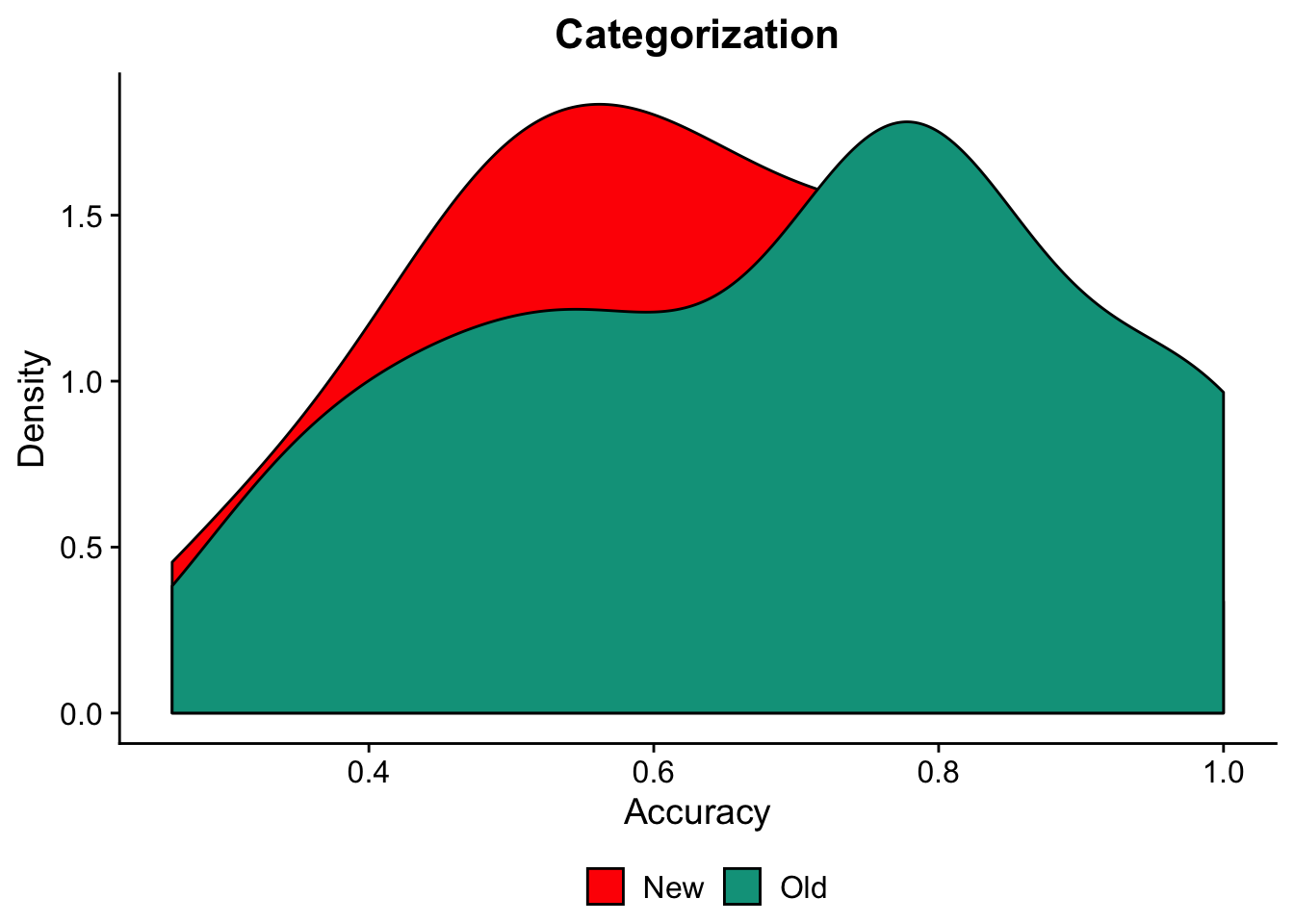
You can see that when we use a density plot, we get a nice look at the distribution of the two groups. However, they are overlapping. This may not be a big deal when we only have two conditions/groups we are comparing. But imagine how much more difficult this would be to visualize our data if we had 3 or more groups.
One thing we could do is use the facet_wrap function to split our distributions into separate but side-by-side charts.
cat_density2 <- ggplot(cat_plot_data, aes(x = accuracy, fill = condition)) +
  geom_density() +
  scale_fill_manual(labels = cat_labels, values = pal) +
  labs(title = "Categorization",
       x = "Accuracy",
       y = "Density") +
  theme(legend.position = "bottom",
        legend.title = element_blank(),
        legend.justification = "center",
        plot.title = element_text(hjust = .5)) +
  facet_wrap(~condition, ncol = 1) +
  theme(strip.background = element_blank(), #Remove the condition labels since we have a legend
        strip.text.x = element_blank())
cat_density2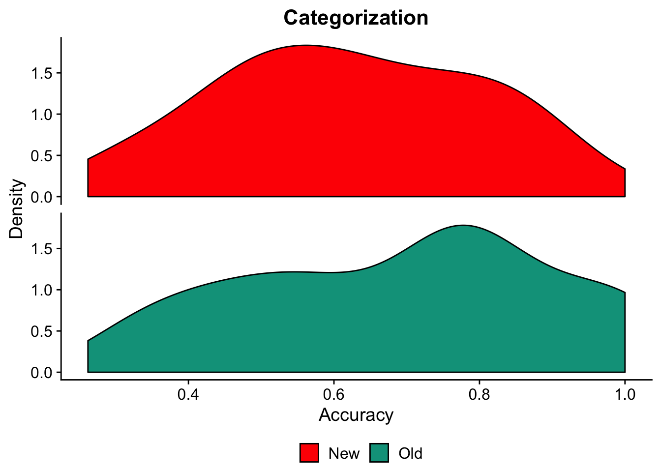
This looks pretty nice! But, violin plots allow us to look at the same information but with all groups included in the same chart. No duplicate y-axis!
Violin Plots
We can plot the same data on a single graph like so:
cat_v_basic <- ggplot(cat_plot_data, aes(x = condition, y = accuracy, fill=condition)) +
  geom_violin(trim = FALSE) +
  scale_fill_manual(values = pal) +
  ylab("Categorization Accuracy (% Correct)") +
  theme(legend.position = "none",
        axis.title.x = element_blank(),
        axis.title.y = element_text(size = 15),
        text = element_text(family = "Arial",
                            size = 25)) +
  scale_y_continuous(breaks = c(0,.25, .5, .75, 1)) +
  scale_x_discrete(labels= cat_labels)
cat_v_basic
Adding dots for individual differences
I can also superimpose individual dots for each subject to help visualize individual differences in the data.
cat_l_basic <- ggplot(cat_plot_data, aes(x = condition, y = accuracy, fill=condition)) +
  geom_violin(trim = FALSE) +
  geom_dotplot(binaxis = 'y', stackdir = 'center', dotsize = .75, fill = "black") + #added dots
  scale_fill_manual(values = pal) +
  ylab("Categorization Accuracy (% Correct)") +
  theme(legend.position = "none",
        axis.title.x = element_blank(),
        axis.title.y = element_text(size = 15),
        text = element_text(family = "Arial",
                            size = 25)) +
  scale_y_continuous(breaks = c(0,.25, .5, .75, 1)) +
  scale_x_discrete(labels= cat_labels)
cat_l_basic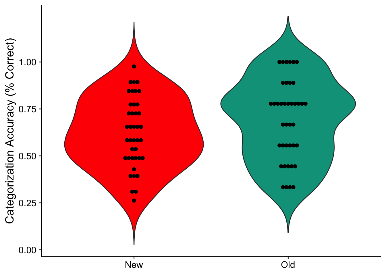
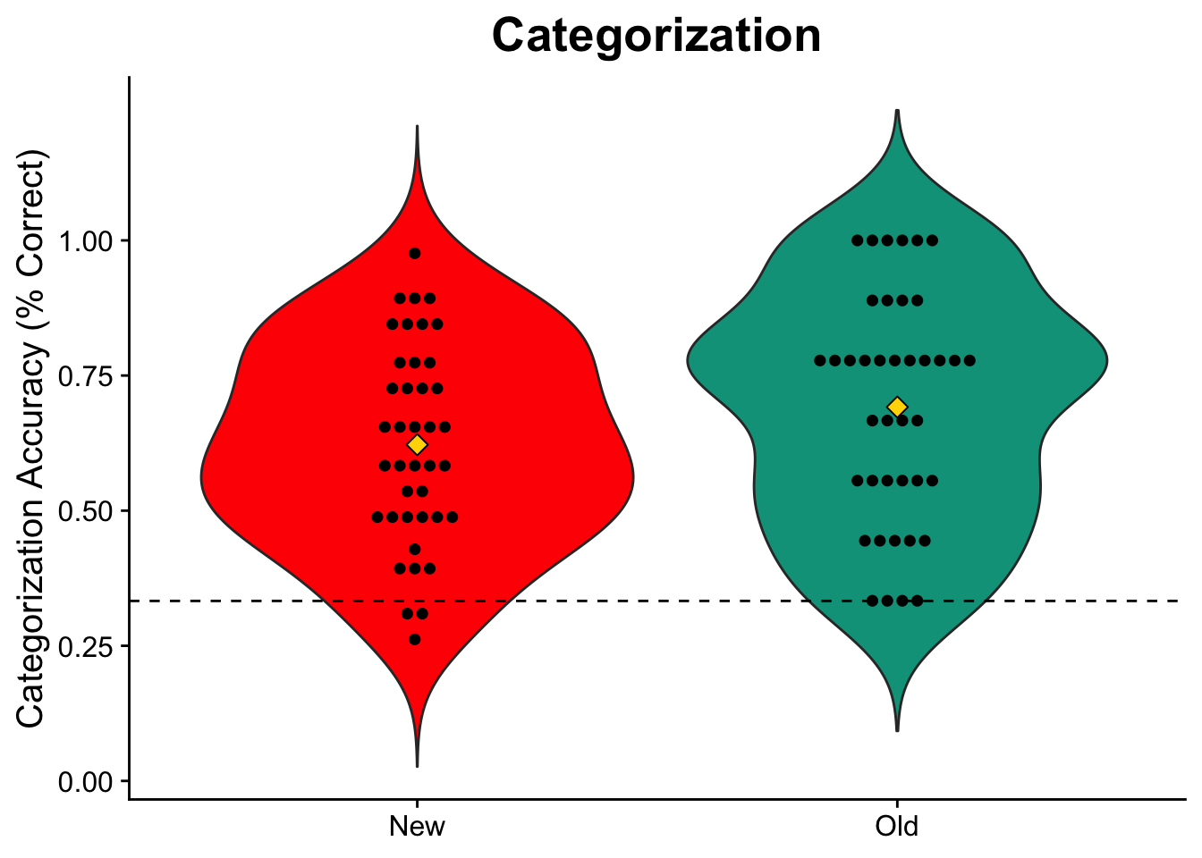
Adding mean and reference line
Want to know the average accuracy? I can also add a marker to denote the mean for each group and a reference line to show where chance performance lies (33% for three categories). I’ll also space the dots further apart from one another so they’re no longer touching.
pal = wes_palette("Darjeeling1", 2, type = "discrete")

## Build plot
cat_v_fancy <- ggplot(cat_plot_data, aes(x = condition, y = accuracy, fill=condition)) +
  geom_violin(trim = FALSE, scale = "count") +
  geom_dotplot(binaxis = 'y', stackdir = 'center', dotsize = .75,stackratio = 1.5, fill = "black") +
  stat_summary(fun.y = mean, geom = "point", size = 3, shape = 23, fill = "Gold") + #adding mean marker
  scale_fill_manual(values = pal) +
  labs(title = "Categorization",
       y = "Categorization Accuracy (% Correct)") +
  theme(legend.position = "none",
        plot.title = element_text(size = 20, hjust = .5),
        axis.title.x = element_blank(),
        axis.title.y = element_text(size = 15),
        text = element_text(family = "Arial",
                            size = 25)) +
  scale_y_continuous(breaks = c(0,.25, .5, .75, 1)) +
  scale_x_discrete(labels= cat_labels) +
  geom_hline(yintercept = .333, linetype = "dashed", color = "black") #added reference line
cat_v_fancy